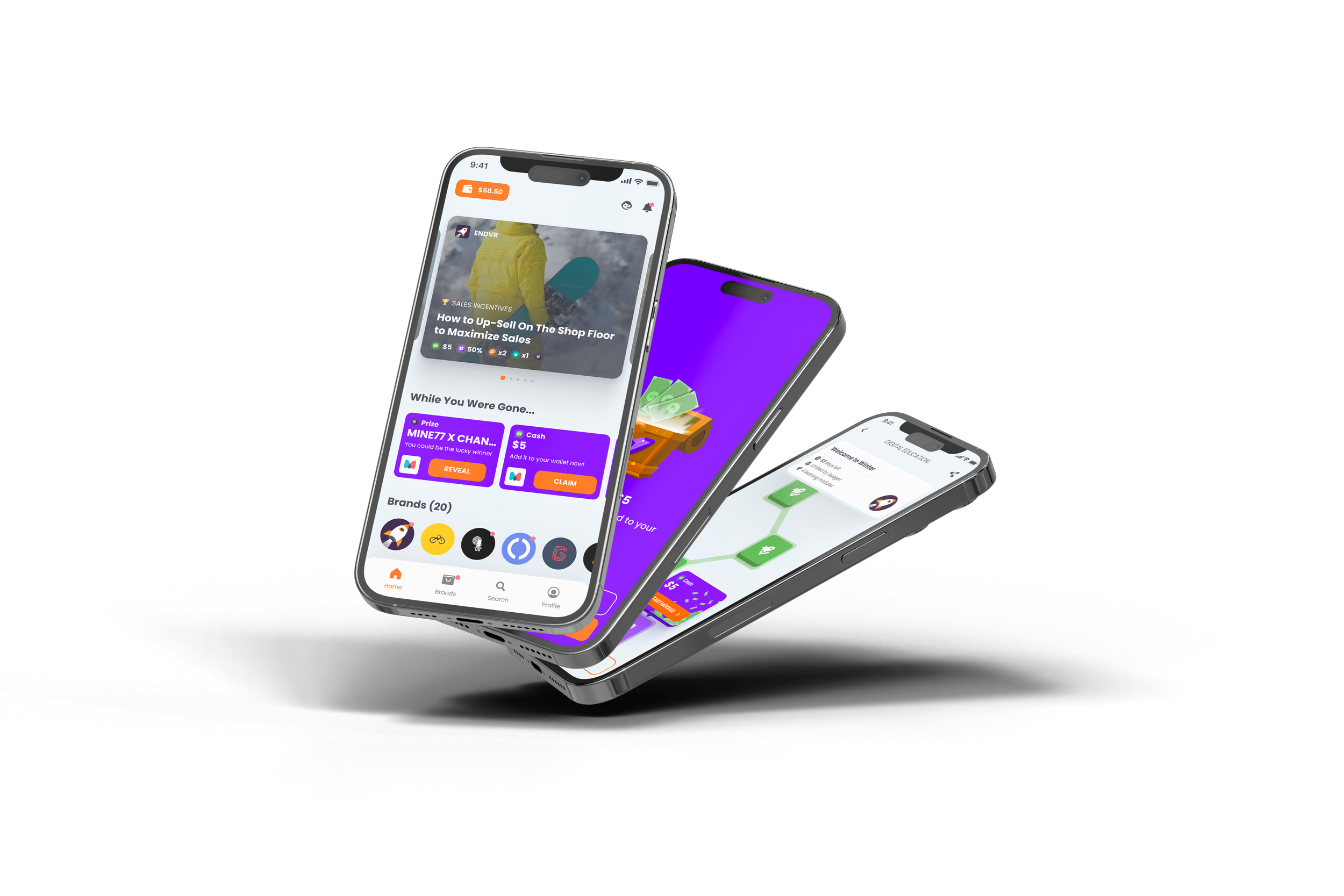
ENDVR Mobile App Revamp
A case study explaining the audit and revamp of a mobile app from research to final designs.
THE ROLE
ENDVR
Mobile App
Involvement
UX/UI Design
Year
2024
THE PROJECT
ENDVR is a platform that connects retail brands with retail workers to incentivize sales through reward-based programs, enhancing sales performance and product knowledge.
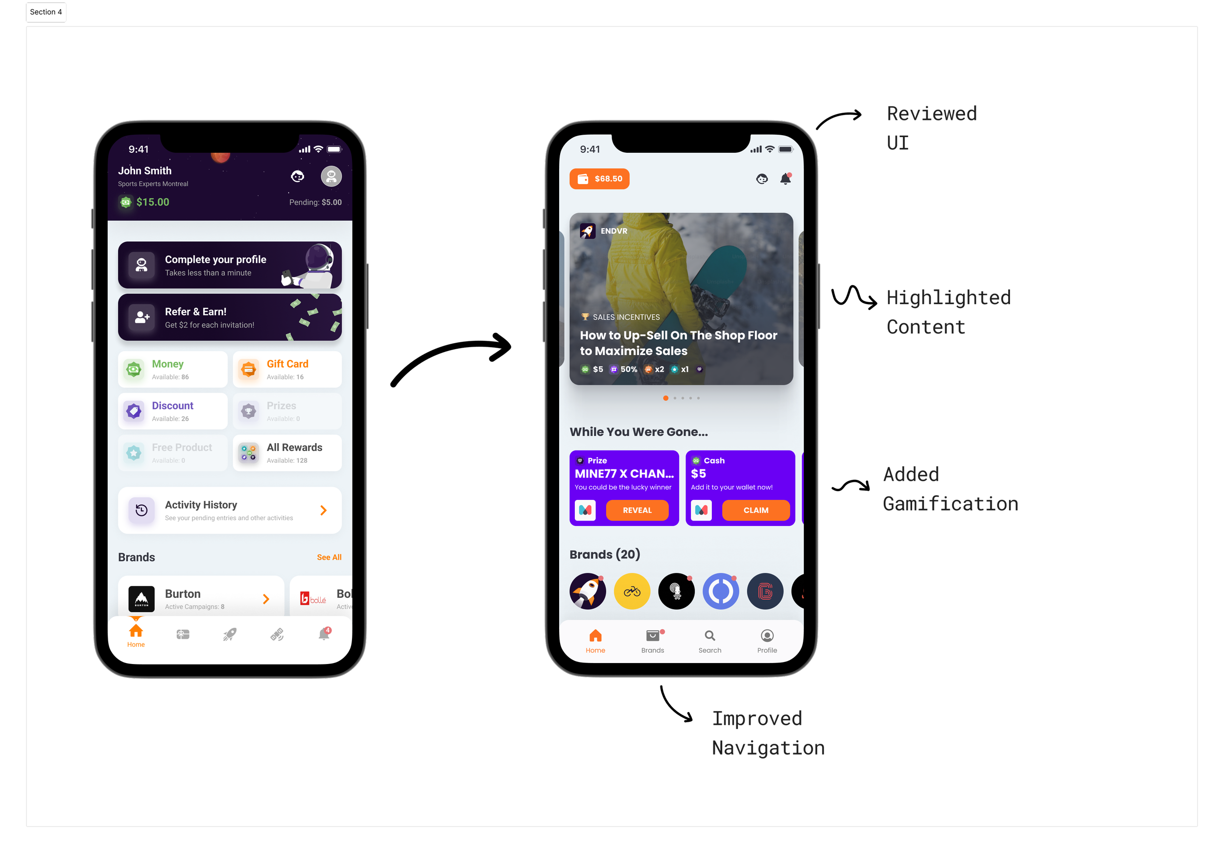
The primary goal of the project was to redesign a cluttered and difficult-to-navigate app used by retail employees. The original app's complexity hindered productivity, so the redesign focused on creating a user-centric tool that streamlined day-to-day operations. The new version aimed to enhance task management, facilitate performance tracking, and integrate a reward system to boost employee motivation and recognition. The redesign was achieved through close collaboration with engineering and product management teams, ensuring that the app's functionality aligned with user needs and business goals.
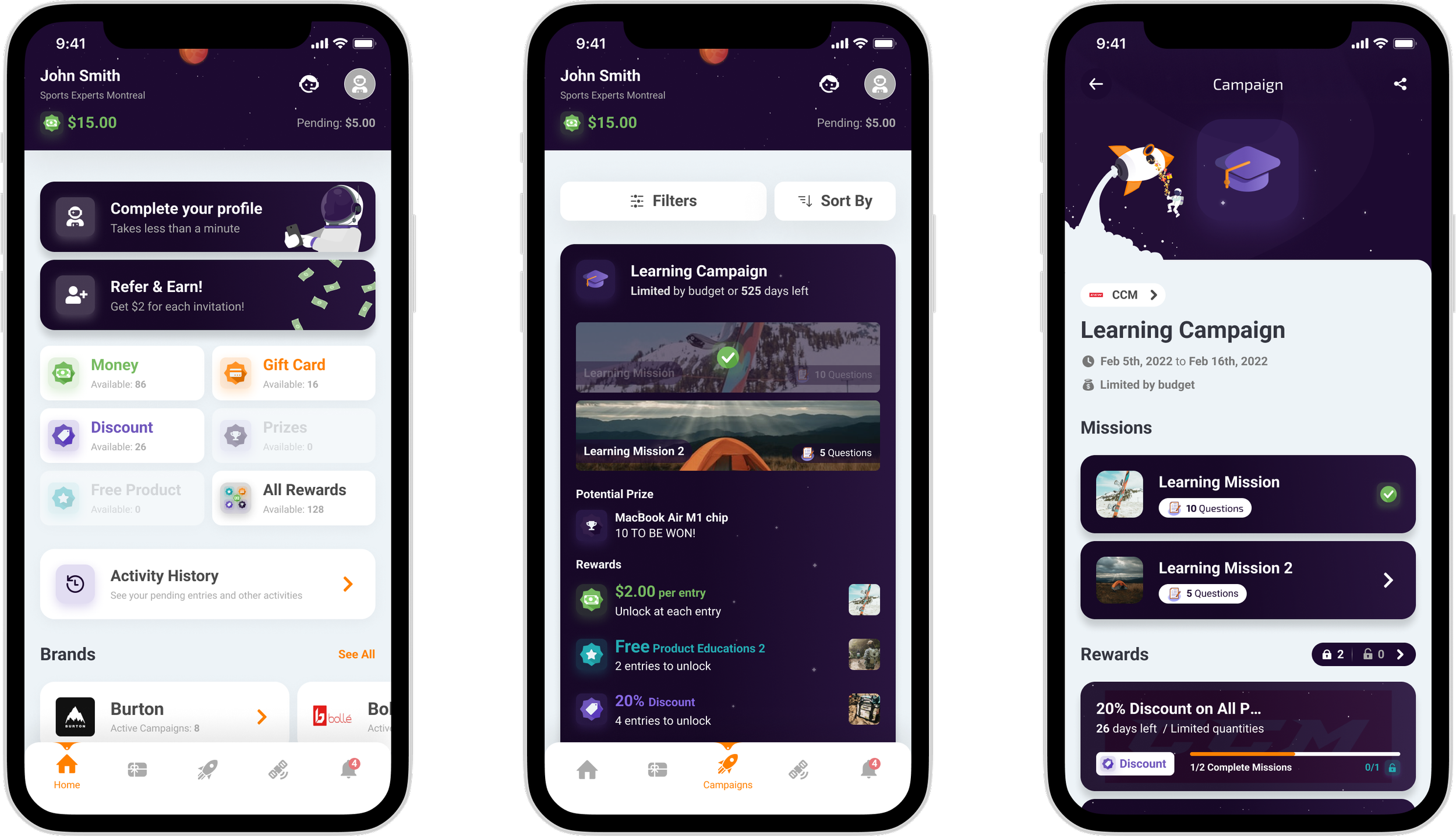
App before the redesign
STAKEHOLDERS FEEDBACKS
Product Team
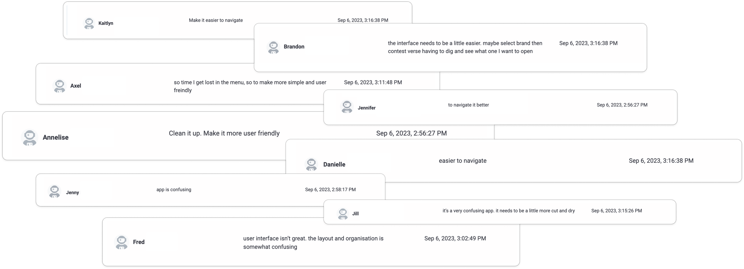
“The navigation is not straight forward... as a user downloading the app i'm not sure where to go... how to complete missions... there is no how-to-guide or one feature that requires my immediate attention when I log in.”
Customer Support (CS) Team
“We need to better communicate with the users that they have qualified for a prize based on submitting the correct amount of receipts or passing a quiz but there is no more codes or money left to reward them.”
BisDev & Sales Team
“Some feedback is that its not intuitive and feels quite clunky. Lots of information makes it hard for users to digest. Difficult to find campaigns as no logic. Poorly laid out information. Lots of navigations and hard to make submissions.”
Primary Feedbacks
USER RESEARCH AND INSIGHTS
We initiated the project with extensive user research, conducting interviews with retail employees and managers to understand their daily challenges. The research revealed that the existing app was cluttered, making navigation difficult. Users often got lost within the interface and struggled to complete campaigns and missions, which significantly impacted productivity. There was a clear need to redesign the system to simplify task tracking and integrate a gamification mechanism, ultimately boosting morale, efficiency, and user engagement by creating a more intuitive and user-friendly experience.
Data collected through a survey
I meticulously planned and executed the creation and distribution of extensive surveys to reach a wide range of users each of them targeting different part of the app. Through this process, I gathered valuable feedbacks that offered statistical insights into user contentment and prevalent challenges.
SURVEYS
Conducting over 50 user interviews offered me deep insights into user behaviors, motivations, and pain points. This interactive approach allowed me to gather rich, qualitative data, enabling me to identify critical areas for improvement and develop user-centric solutions that significantly enhanced the overall user experience.
USER INTERVIEWS
Conducting usability testing sessions provided me with valuable insights by allowing me to closely observe actual users engaging with the application. Through this interactive method, I could pinpoint usability issues and recognize key areas that required enhancement.
USABILITY TESTING
The majority of users pointed out an inefficient navigation and difficulties finding relevant content.
67% of users navigate by browsing through brands and see what campaign appeals to them the most.
60% of users feel a sense of pride and happiness from earning rewards.
KEY TAKEAWAYS
Simplify the app's menu structure and include quick links on the home screen for easy access to popular features and content areas, reducing the need for extensive navigation.
Implement a dedicated section or filter options that allow users to easily explore campaigns and content organised by brands available.
Provide real-time notifications when users earn rewards, accompanied by congratulatory messages or visuals, enhancing the sense of achievement and happiness associated with earning rewards.
OPPORTUNITIES
Sophie, a 28-year-old retail employee who is tech-savvy but frustrated with the current app. Sophie finds the existing interface cluttered and difficult to navigate, leading to confusion and incomplete tasks. She values efficiency and clear direction in her daily work, seeking a tool that allows her to easily track her performance, complete tasks, and earn recognition. The redesigned app focuses on simplifying navigation, providing clear task flows, and integrating a rewards system to keep Sophie motivated and engaged.
MAIN PERSONA
-
Hunter, 28, Sales Associate
--
Frustrations:
Lack of personalized notifications, advanced search filtersNeeds:
Personalized notifications, advanced search filters, rewards tracking dashboardRedesign Focus:
Implement personalized notifications, advanced search filters, goal progression visuals -
Sarah, 45, Retail Manager
--
Frustrations:
Limited in-depth discussions and networkingNeeds:
Access to industry insights, forums, and expert-led webinarsRedesign Focus:
Implement in-depth discussions, forums, virtual meetups, and webinars
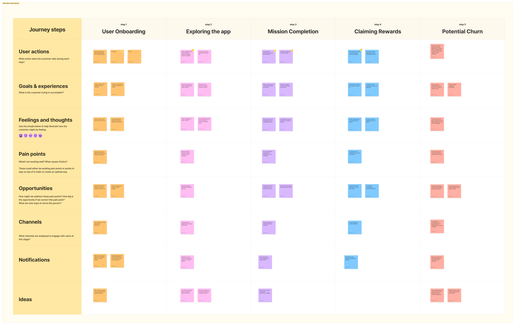
Key Insight: The journey map revealed critical dependencies between the mobile and web apps. Brands create learning campaigns on the web app, which then appear on the mobile app for in-store sales associates to engage with and earn rewards. Understanding this flow was crucial to aligning the design across both platforms.
Result: The journey map became a blueprint for redesign, ensuring we addressed every pain point and maximized user engagement at each step. It was a game-changer in making the app more intuitive and rewarding for users. 🚀
JOURNEY MAPPING
Summary of Issues: Based on the data collected, I identified the main issues and proposed several axes of improvement. This summary served as a foundation for the redesign process.
Collaboration: I worked closely with the UI designer and the product manager over the next few months. Together, we revamped the app, ensuring user involvement at every stage. I consistently tested new designs and validated user flows with actual users to ensure the app met their needs and expectations.
The focus was on enhancing user engagement through gamification and personalized content.
DEVELOPING A REDESIGN STRATEGY
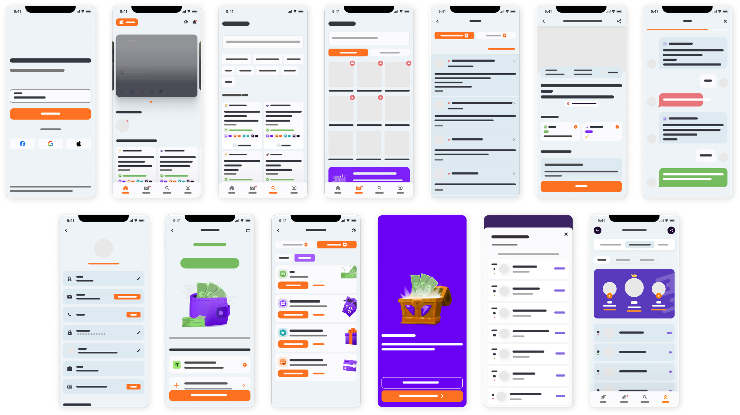
Wireframing and Architecture Review
One major challenge was balancing the functionality of task management with a seamless user experience that didn’t overwhelm the employees. Our solution was to implement a modular interface where tasks and achievements are displayed in an organized, non-intrusive manner. This approach allowed employees to focus on their immediate responsibilities while being reminded of their progress and growth opportunities.
Specific Challenges:
Creating a balance between task-oriented and achievement-oriented features.
Designing for a diverse user base with varying levels of tech savviness.
Solutions Implemented:
A clean, minimalist interface to reduce cognitive load.
Contextual tooltips and a straightforward onboarding process to help users navigate the platform effectively.
CHALLENGES AND SOLUTIONS
PRODUCT OUTCOMES
Enhanced User Activation: Improved user activation rate by 30% through sign-up enhancements, resulting in a higher number of new users completing initial setup.
Increased User Retention: Increased user retention by 20% via targeted engagement strategies, leading to more users returning to the app consistently over time.
Improved App Stickiness: Boosted app stickiness by 25% through in-app gamification, relevant notifications and consistent user engagement, resulting in more frequent and prolonged app usage.
User Feedback Integration: Continuous user testing and feedback loops were critical in refining the design and functionality of the app.
Cross-Functional Collaboration: Effective collaboration with the UI designer and product manager streamlined the redesign process.
Stakeholder Engagement: Regular communication with stakeholders ensured alignment on objectives and priorities.
WHAT WENT WELL?
Marketing Team
I worked with the marketing team to gather valuable insights on user behavior and preferences. This helped me understand what features were most appealing to users and how they interacted with the app.
TEAM COLLABORATION
Customer Service (CS) Team
Partnering with the CS team, I helped create comprehensive knowledge base (KB) articles. This ensured users had access to self-help resources, which in turn, reduced the number of support requests.
Customer Success Managers
I collaborated with CSMs to understand user needs and pain points. This direct feedback was invaluable in identifying areas of improvement and feature requests.

By focusing on user needs and iterative design, I successfully created a more engaging and effective app. This project highlighted the importance of user-centered design and the impact of data-driven decisions.
As a result, the sales associates are now better equipped with the necessary knowledge and skills to perform their roles efficiently, demonstrating the success of this strategic enhancement in the app's design and contributing to the overall success of ENDVR’s business objectives.
CONCLUSION
