Shoutcast SaaS Platfom Redesign
A case study explaining the audit and revamp of a Legacy SaaS platform from research to final designs.
Shoutcast
SaaS
Involvement
UX/UI Design
Year
2022
THE ROLE
The project involved a complete redesign of the Shoutcast web platform, a popular internet radio service. The goal was to modernize the user experience and interface, making it more intuitive and engaging. The redesign focused on enhancing usability for both radio station administrators and listeners.
Key improvements included a streamlined navigation system, a more visually appealing layout, and new features to simplify station management and listener interaction. The updated design aimed to boost user satisfaction and increase overall engagement with the platform.
THE PROJECT
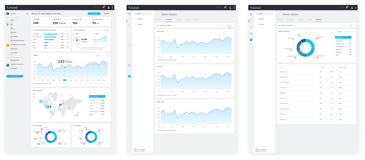
Platform before the redesign and architecture restructuring
CROSS TEAM COLLABORATION
To gather valuable insights, I teamed up with the marketing team, who had a deep understanding of our user base and their behaviors. Together, we analyzed user data, feedback, and trends. Here’s how this collaboration played out:
Data Sharing: The marketing team shared detailed analytics on user demographics, behavior patterns, and feedback.
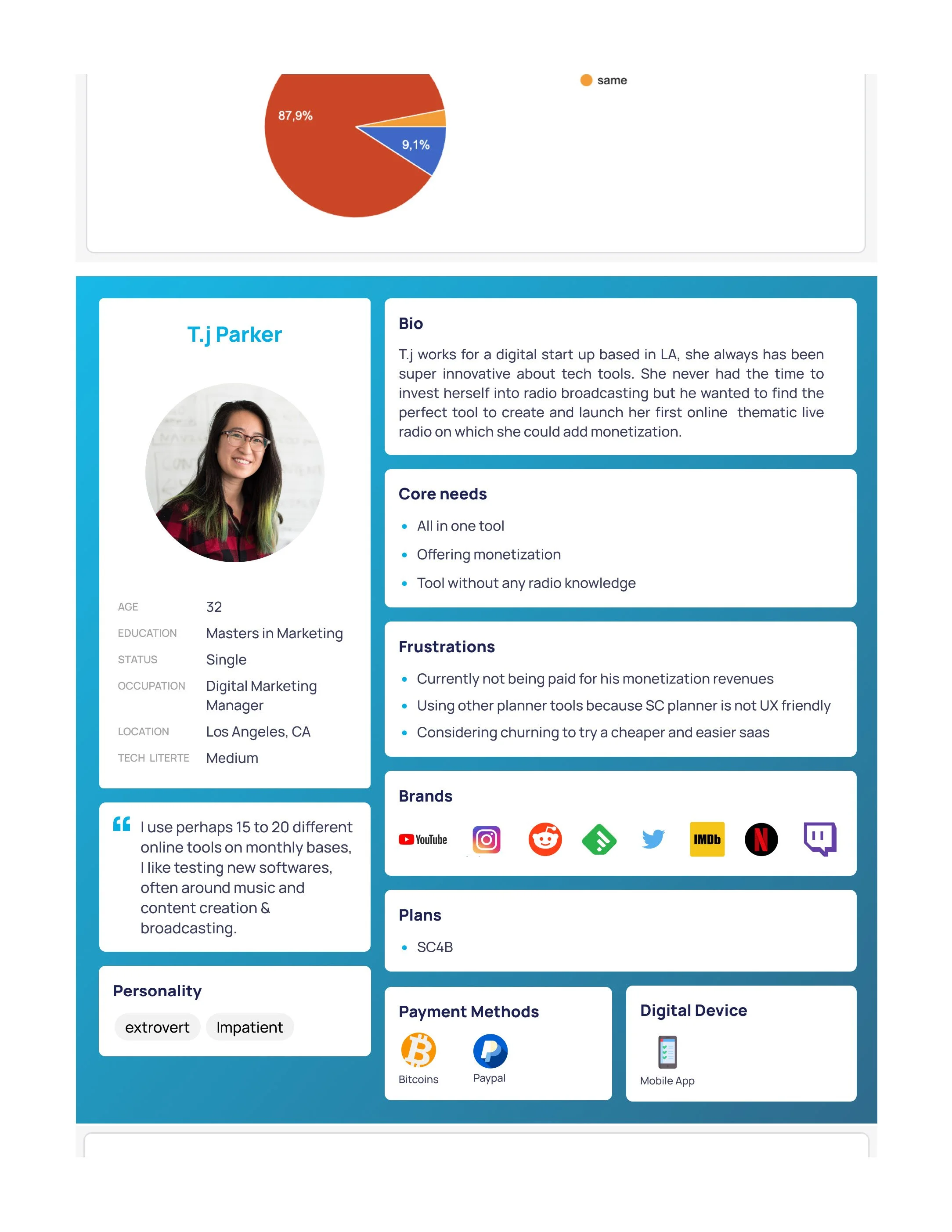
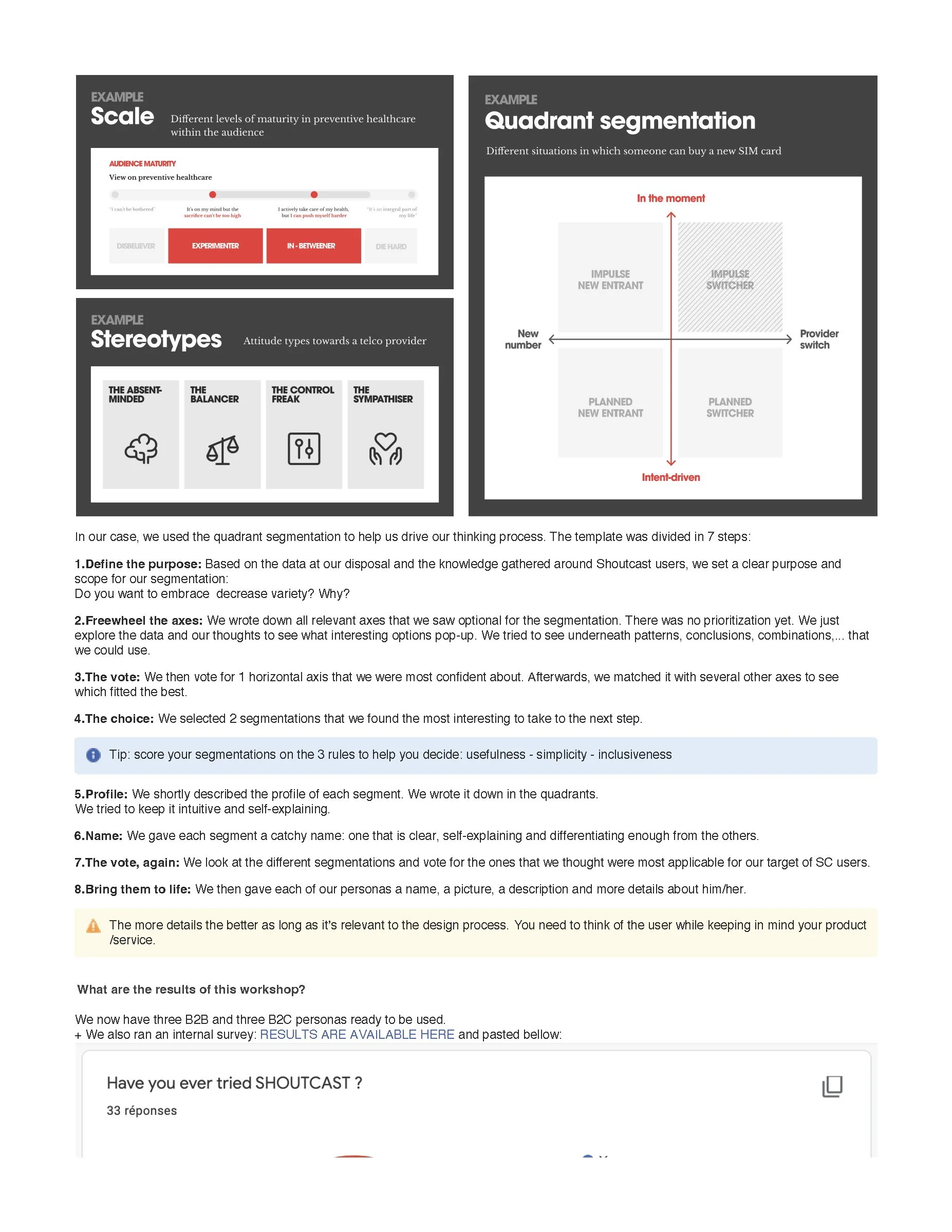
User Persona Development: We co-created user personas to better understand and empathize with our target audience.
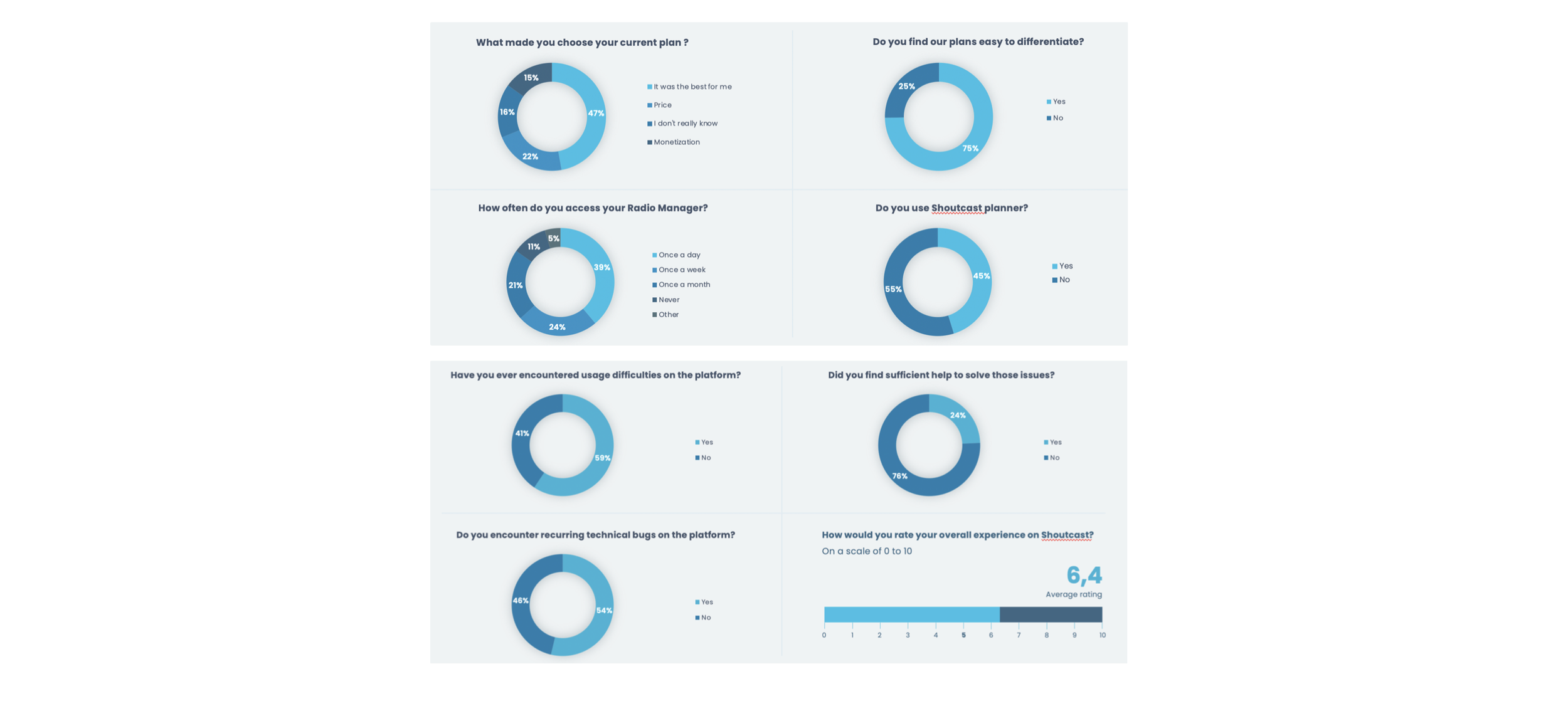
Survey Design: We designed surveys that the marketing team distributed to gather specific feedback on user experience and preferences.
Kevin, a seasoned sound engineer, needs reliable broadcasting software with strong audience reach and online storage; however, he is frustrated by unstable technology and the lack of tools to expand his audience. The redesign strategy should focus on enhancing technology stability, providing new audience engagement tools, and ensuring a seamless transition for his extensive music library.
MAIN PERSONA
-
Frustrations: Struggles with not getting paid for ad revenue, finding other planner tools easier to use, and difficulty in reaching larger audiences.
Needs: Requires an efficient broadcasting tool, stable software, and monetization features.
Redesign Strategy: Focus on a customized B2B plan to better meet his professional broadcasting needs.
-
Frustrations: Faces challenges with monetization, finds the current planner not UX-friendly, and is considering switching to a more affordable and easier-to-use SaaS tool.
Needs: Seeks an all-in-one tool that offers monetization and is user-friendly, even without prior radio knowledge.
Redesign Strategy: SC4B plan should prioritize ease of use, especially for users new to radio broadcasting.
A lot of these feedbacks relied on technical issues
How can I, as a designer, enhance the user experience on the platform while preserving its legacy essence?
From reviewing UI to helping the support team establishing a better communication funnel with the users these examples represent just a fraction of the insights we collected from this survey, but they underscore the fact that dissatisfied customers provide valuable feedback.
TURNING FEEDBACK INTO ACTION
Study results conducted with 389 users
USER RESEARCH AND INSIGHTS
65% of users claim to use the platform as a side occupation or in a work-related capacity, but not as their primary occupation
60% of users claim to have difficulty using the platform, the majority being intermediate users with more than one radio station
39% of users, are not radio professionals or working remotely in the radio industry -claim to use our solution at least
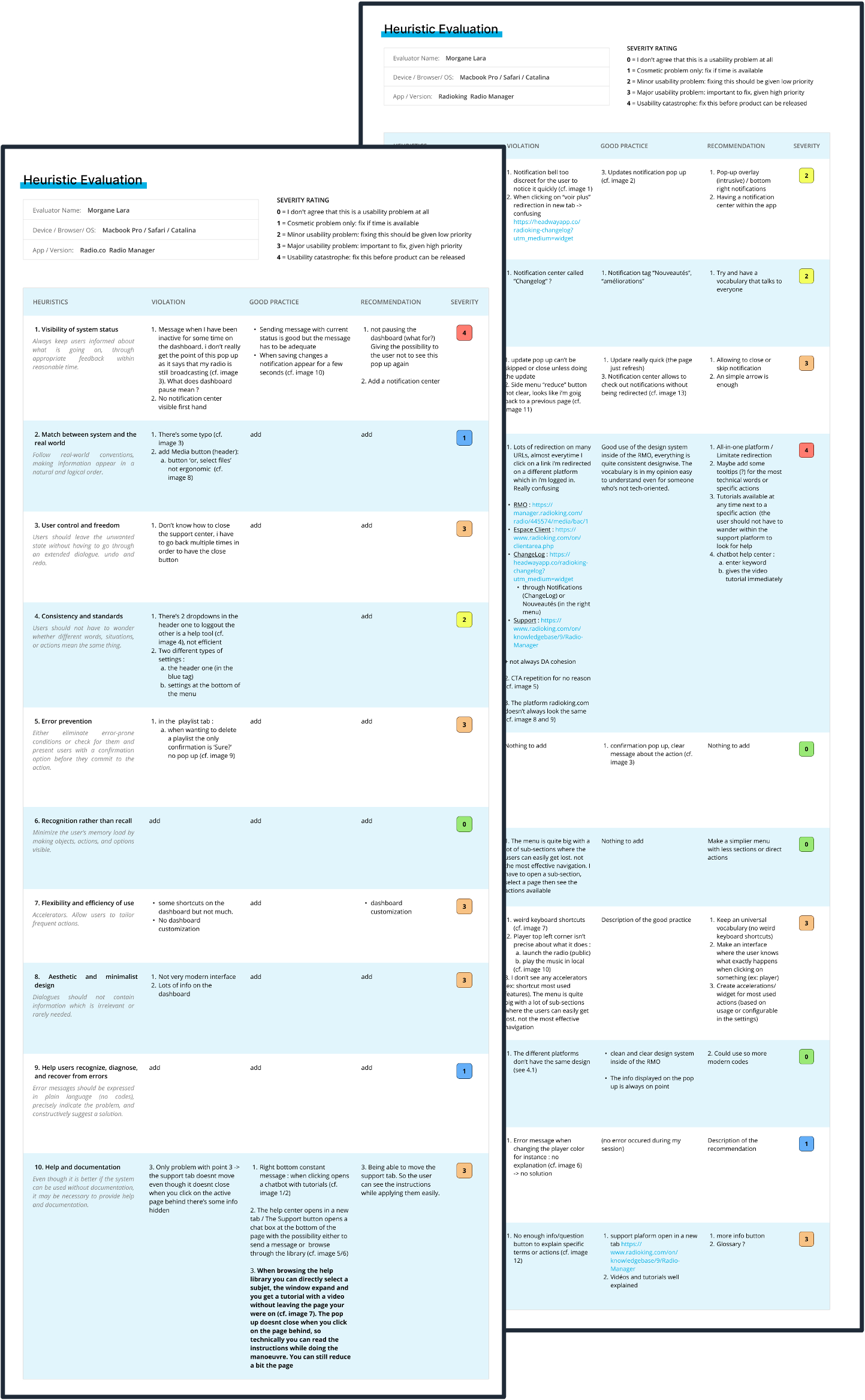
This Heuristic Evaluating gave a lot more perspectives on good practices, errors to avoid and areas of improvements:
Visibility of system status
Match between system and the real world
User control and freedom
Consistency and standards
Error prevention
Recognition rather than recall
Flexibility and efficiency of use
Aesthetic and minimalist design
Help users recognise, diagnose, and recover from errors
Help and documentation
THE COMPETITION
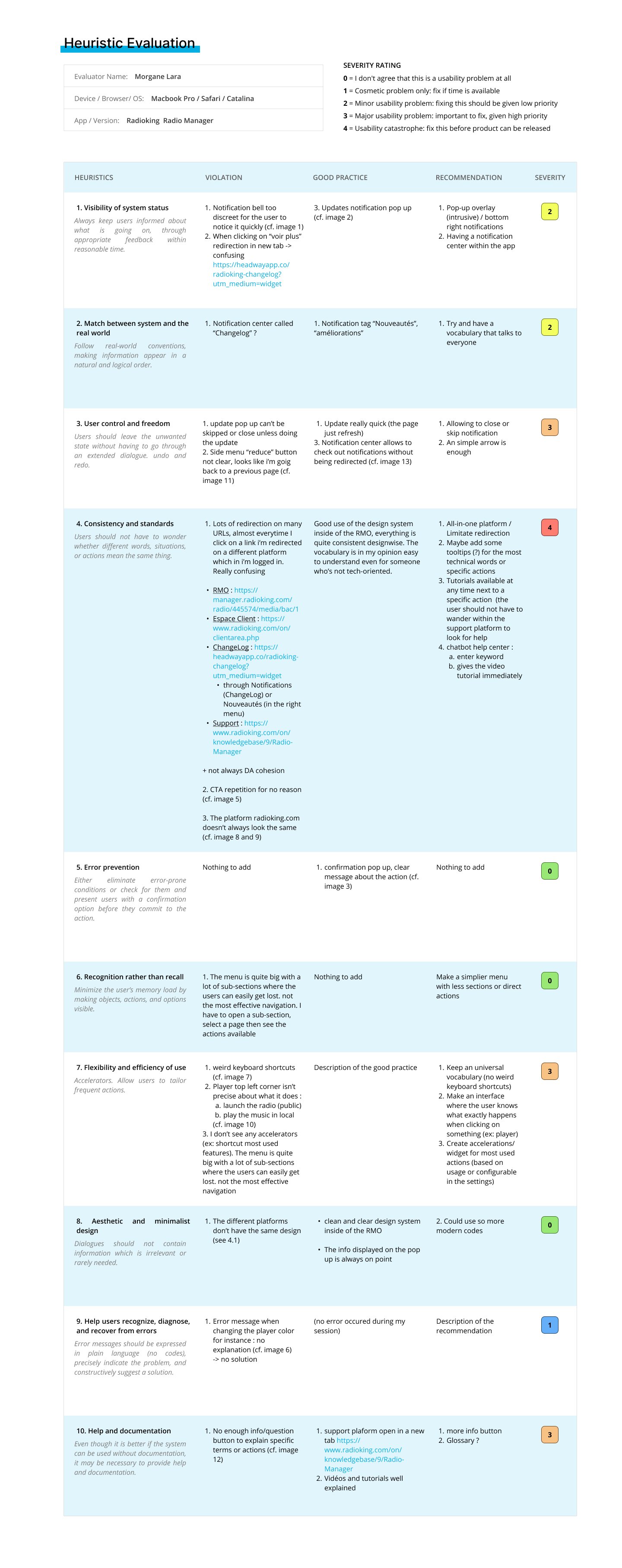
Competitors Heuristic Evalution
Recognising best practices underscored our existing strengths and identified opportunities for enhancing our user experience, such as improving UI design and refining UX writing. Identifying pain points revealed shared challenges with our competitors in terms of user experience, pinpointing areas for improvement to create a platform that users choose not just because it's the least cumbersome, but because it's the superior choice.
THE RESULTS
On Screen
Alerts ✅
Ephemeral and non disruptive experience
TO DO
Support Platform ✅
Tutorials and videos (opens in a new tab for a non disruptive experience)
Customised Dashboard ✅
For a more personalised experience
Notification
Center ✅
Allows to check out notifications without being redirected
Good UI and UX Writing ✅
User-friendly interface and accessible language for non-tech users
Unexplained error messages 🛑
No context or explanation was provided
TO AVOID
Multi-channels Parameters 🛑
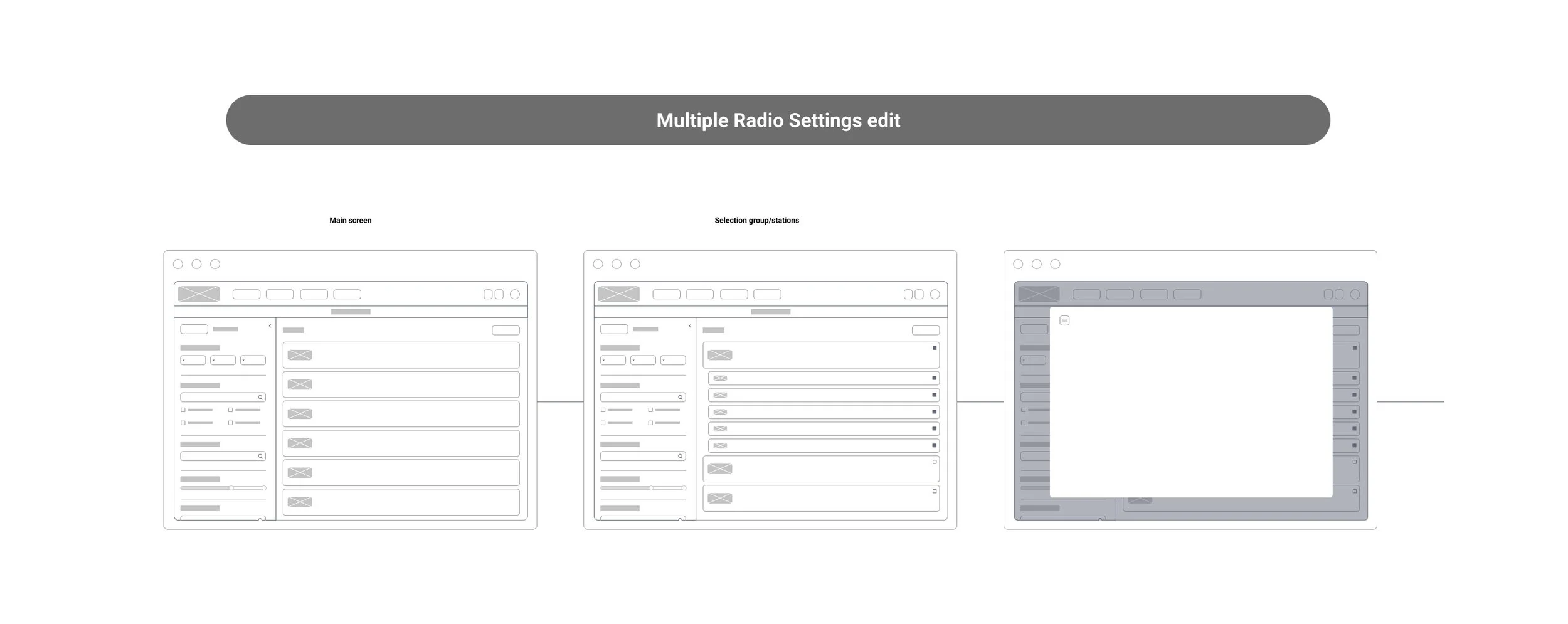
Different entries for settings and parameters
Pop-up
Overlays 🛑
Intrusive sequence of disruptive pop-ups breaking
the user experience
Lots URLs redirections 🛑
Redirection on a different platform with log in required
Extensive
Navigation 🛑
Numerous sub-sections that may confuse users
An overview of user research
TESTING
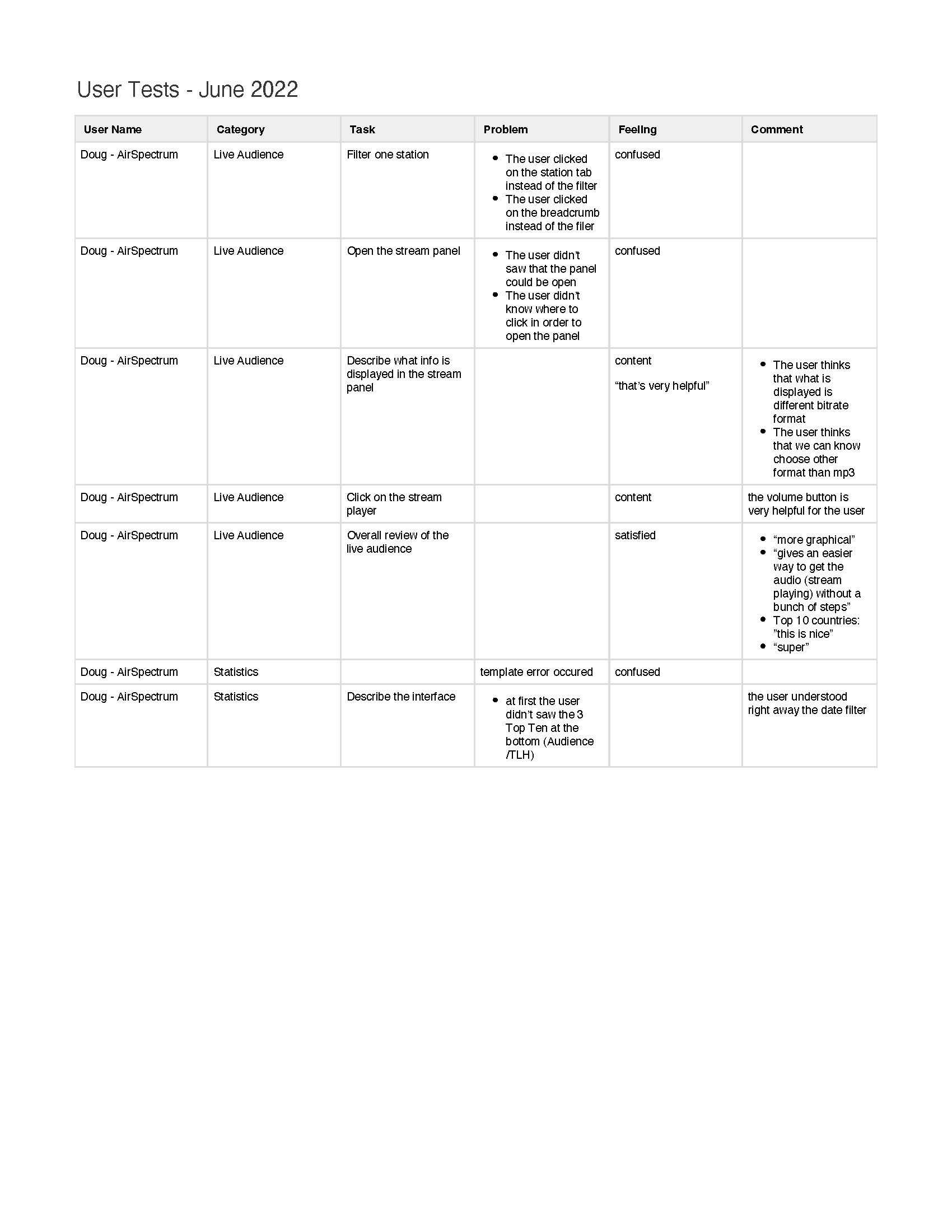
Sessions conducted with 5 users | Minimum Guidance
ACTION: ADD STATION + LIVE AUDIENCE
✅ All Users found the « Add station Button easily »
❌ % of monetised stations might not be a clear concept
❌ « Subscription Protection » might not be clear enough
⚠️ All users would like to have a quick way to monitor the stream (i.e green = stream is good, orange = problem, red = stream down)
DASHBOARD
✅ All users understood the filter function but struggled on the first use
❌ TLH is an important data that should be at the top (not buried in the middle)
⚠️ Export data to a .csv file is potentially desirable
⚠️ Information missing from the dashboard
Are all the labels in the flows clear to most users?
Are there usability issues in the flows?
Do users find the info on the Dashboard useful?
Can users understand and use the filters on the Dashboard?
What can be done to improve Add a station and Dashboard flows?
REMANING QUESTIONS
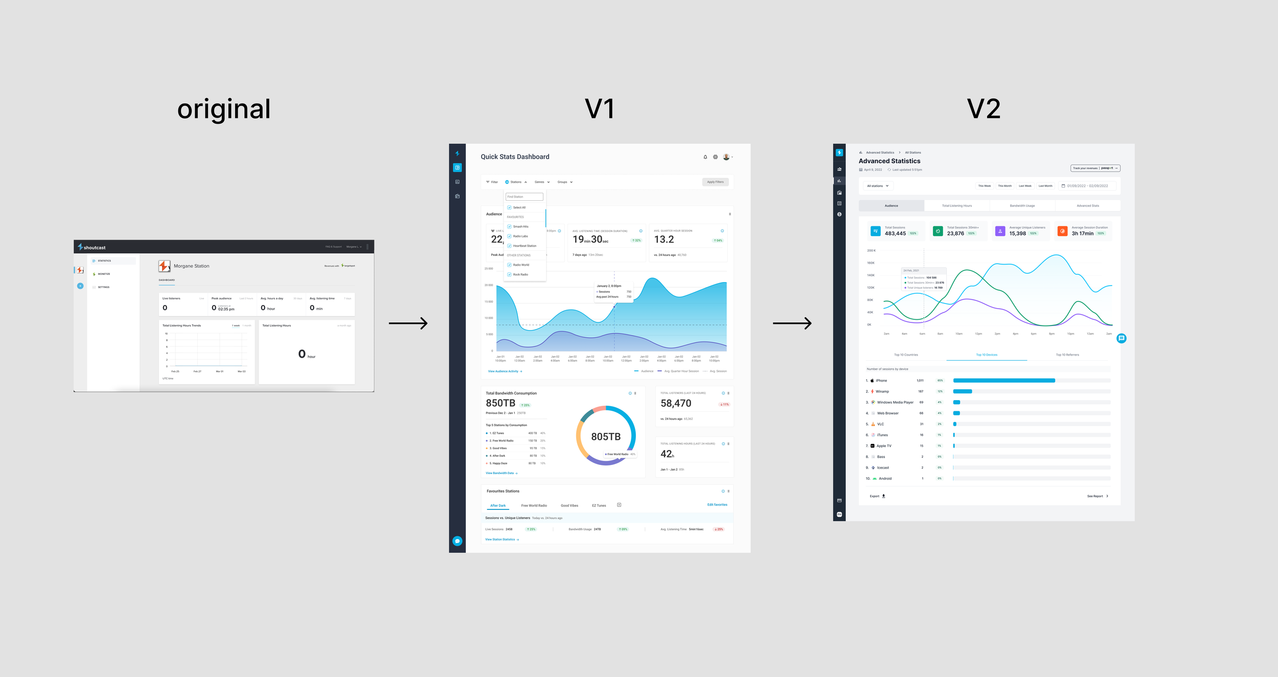
Design Evolution of the App
Starting from the original platform most of the work was to sort out the features and their usefulness in order to offer a lighter and more comprehensive experience. Surveys, interviews and user tests have been of high importance in retargeting user needs and expectations.
WORKING BY ITERATIONS
MORE TESTING
Sessions conducted with 5 users | Minimum Guidance
ADD STATION + LIVE AUDIENCE
✅ % of monetized stations is now a clearer concept
❌ Users have trouble using the filter panel
⚠️ Users often mistake the breadcrumb with a filter tab
❌ Format and bitrate needs to be clearer
DASHBOARD
❌ Radio live stream panel is not easily accessible
✅ The users really enjoyed the fact that they can play live their stations and that it shows the current status ((i.e green = stream is good, orange = problem, red = stream down)
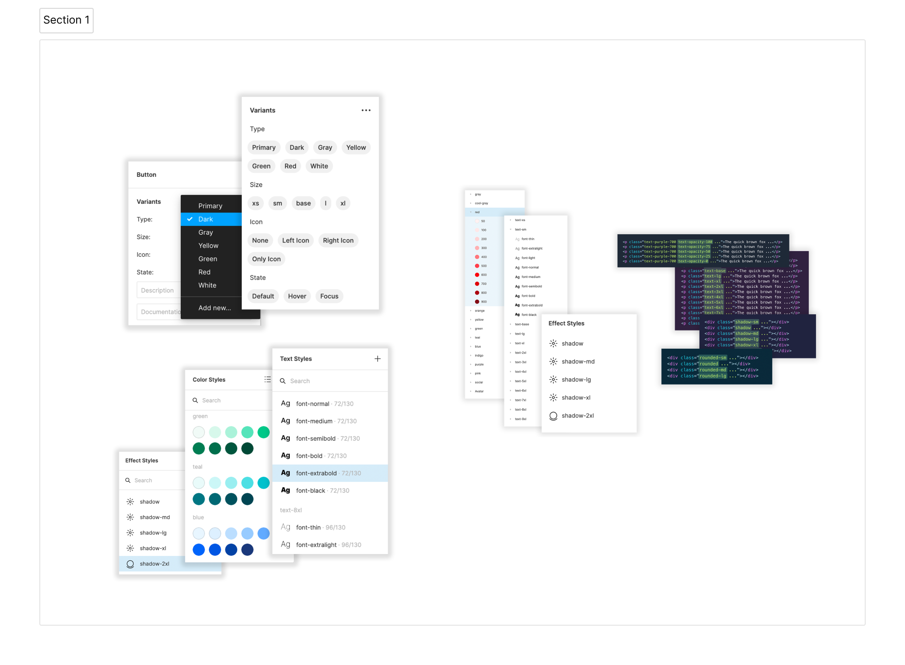
To speed up delivery, it was decided to use an existing component library and user interface kit called Tailwind. This allowed the design team and the development team to have access to the same component library and templates without having to worry about consistency during the handover. This time savings allowed for more user testing and review before final delivery.
View of Tailwind CSS UI KIT on Figma
COMPONENTS LIBRARY AND UI KIT

Improved User Experience: Streamlined the platform by eliminating outdated features and refining user flows based on user feedback, led to a more intuitive and user-friendly experience.
Increased User Satisfaction Increased: Conducted extensive user research including interviews, workshops, and tests, resulting in a 30% increase in user satisfaction.
Enhanced Collaboration and Efficiency: Implementing Tailwind as the component library and UI kit, facilitated a seamless collaboration between design and development teams. This initiative reduced design-to-development handoff time by 50%, allowing for more iterations and user testing cycles before final delivery.
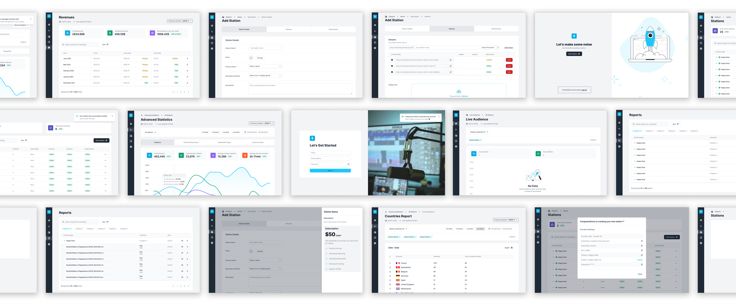
View of the redesigned platform
FINAL OUTCOMES
The project successfully revitalised Shoutcast by enhancing user experience and optimising collaboration between design and development teams. Through a methodical approach to user research and iterative design, we streamlined workflows and improved platform usability. By implementing Tailwind for consistency in design elements, we ensured a unified user interface and efficient development process. This project not only delivered a more user-friendly platform but also fostered a collaborative environment favourable to ongoing improvements and innovation.
CONCLUSION
